Cold Email Benchmarks: What Counts as a Good Reply Rate?
RedHub AI Editorialupdated October 4, 20266 min read

Jump to a section7
No published set of cold email benchmarks can tell you what a good reply rate is for your list. The number that matters is whether your own positive reply rate is rising on a comparable list. Published figures disagree because they mix industries, list quality and definitions of a "reply," and even one vendor's pages disagree with each other. So the useful benchmark is your own baseline, measured the same way each time, that you try to beat month over month.
TL;DR: A published reply rate measures someone else's lists under someone else's definition. Instantly's 2026 benchmark report puts the average at 3.43% of emails sent, counting every reply, while the rate this guide recommends counts only interested replies over delivered emails, so the two can't be lined up. Benchmark against your own positive reply rate trend on a comparable list. The Cold Email Reply-Rate Optimizer ($39) ranks your variants on that number. Part of the guide on improving your cold email reply rate.
What a published benchmark is measuring
Take one vendor's report. Instantly, which sells cold-email outreach software, says its 2026 Cold Email Benchmark Report analyzes billions of cold email interactions across workspaces on its own platform. It puts the average reply rate at 3.43%, the top quarter of campaigns at 5.5% or more, and the top 10% at 10.7% or more. Its reply rate is every reply, follow-ups included, divided by total emails sent.
Line that up against your own number and three things differ. Instantly divides by sent, so bounces sit in its denominator, while a positive reply rate divides by delivered. Instantly counts every reply, so "unsubscribe" counts. A positive reply rate counts only interested ones. And its population is Instantly's users, with their lists, offers and industries, not yours. None of that makes the report wrong. It makes it a measurement of something else.
One vendor, two answers
Instantly's own reply-rate guide, updated July 1, 2026, gives a different scale: "5-10% is solid for B2B. 10-15% is excellent. 15%+ is best in class on tight segments." On the report's figures, a campaign at 6% sits in the top quarter. On the guide's, the same campaign is merely solid. Both pages come from one company in one year, and a reader quoting either would sound authoritative.
So we are not going to give you a good cold email reply rate. A number measured on someone else's list, with someone else's definition of a reply, would tell you nothing true about yours. Published figures are useful for one thing: knowing roughly what scale other senders report, so a 40% target doesn't look normal. They don't make a pass/fail line.
The only benchmark that's yours
Benchmark against yourself. Measure your positive reply rate, interested replies over delivered, on a defined list, then try to beat that same measurement next month on a comparable list. That holds the offer, the targeting and the definition of "positive" constant, so a rising trend is real progress. A headline average tells you nothing about whether you improved. The consistency is the whole point, which is why a fixed definition of "positive" matters so much (see the positive reply rate guide).
A ranking beats a single number
Even for your own data, one average hides the story. It's more useful to see each variant ranked, with its raw and positive rates side by side and any bounce problem flagged, than to argue over a decimal point. A ranked list tells you what to do next. The Optimizer turns "is this good?" into "which variant is best?", and marks any variant whose bounce rate is above 2% "Fix list" so a dead list can't win.
The Optimizer carries reference bands of its own, and they come from published sources too. Its Benchmarks & Method tab names four, Instantly among them, and its "vs benchmark" column grades each variant's raw reply rate against those ranges. That column is useful when you have no history yet and want a rough sense of scale. It is also a borrowed number, the kind this post warns about. The same tab tells you to validate against your own data, and the rank that picks the winner uses only your positive reply rate. Read the band as context, and act on the rank.
When a "bad" rate isn't about the number
If your rate looks low against your own history, don't assume the copy got worse. The drop is often a foundation change: a staler list, a new sending domain, a deliverability slip. Before concluding your reply rate is "bad," rule out the causes in why cold emails get no replies. When you do change the copy, change it through a clean test per the A/B testing guide, so the next number is trustworthy.
Build a baseline you can beat
Log each variant's delivered emails, replies, positive replies, meetings and bounces in one spreadsheet. The Optimizer ranks them on positive reply rate, shows raw and positive rates side by side, and flags a bounce rate too high to trust.
Get the Cold Email Reply-Rate Optimizer — $39Pairs well with
If a drop traces to the list, the Lead Source ROI Scorecard ($49) grades each lead source SCALE, FIX or CUT on qualified-lead rate, cost per qualified lead, close rate and return on spend. If it traces to a domain, the Email Deliverability & DMARC Enforcement Readiness Gate ($79) grades each sending domain ENFORCING, AT RISK or FAILING against the Google, Yahoo and Microsoft bulk-sender rules. And when the positive replies come in, the Lead-to-Meeting Engine ($149) scores each BOOK NOW, NURTURE or DECLINE and drafts a reply proposing real open times for you to send.
More in this guide
What is a good cold email reply rate?
There's no honest universal answer. It depends on your industry, list quality and how you define a reply. The useful benchmark is your own positive reply rate trending up on a comparable list, not a figure from a vendor's report.
Why shouldn't I trust published reply-rate benchmarks?
Because they measure other senders' lists under their own definitions. Instantly's 2026 report divides every reply by emails sent, while a positive reply rate divides interested replies by emails delivered. Instantly's own guide also uses a different scale from its report, so even one source doesn't give one answer.
What's the average cold email reply rate?
Instantly's 2026 Cold Email Benchmark Report, drawn from its own platform's users, puts it at 3.43% of emails sent, counting every reply. That's one vendor's population under one definition, so treat it as rough context and compare yourself with your own baseline.
How do I set my own benchmark?
Measure your positive reply rate, interested replies over delivered, on a defined list with a fixed definition of "positive," then try to beat that same measurement next month on a comparable list. Holding the definition constant is what makes the trend trustworthy.
My reply rate dropped. Did my copy get worse?
Not necessarily. A drop against your own history is often a foundation change, like a staler list, a new sending domain or a deliverability slip, before it's a copy problem. Rule out targeting and deliverability first, then test copy changes cleanly.
How does the Optimizer handle benchmarking?
It ranks your variants on positive reply rate, so the question shifts from "is my number good?" to "which variant is best?" It also grades raw reply rate against reference bands drawn from published sources, which it tells you to validate against your own data, and it flags a bounce rate above 2% so a low rate isn't misread as a copy problem.
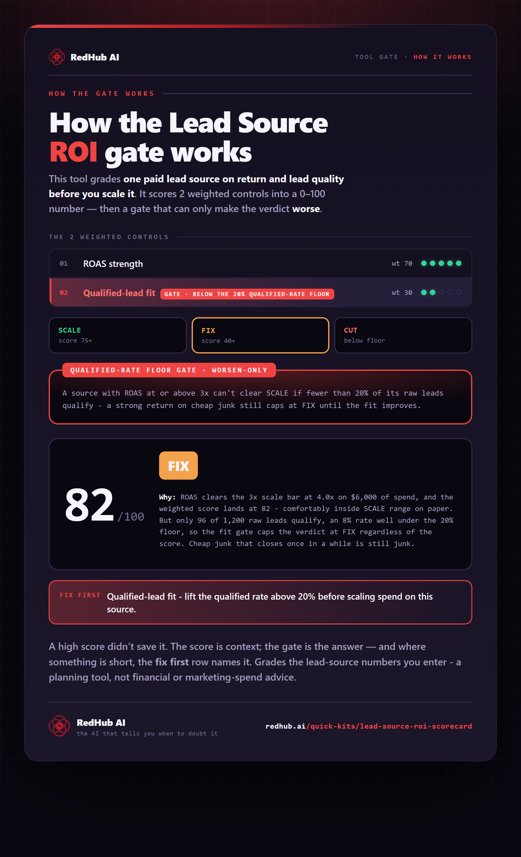
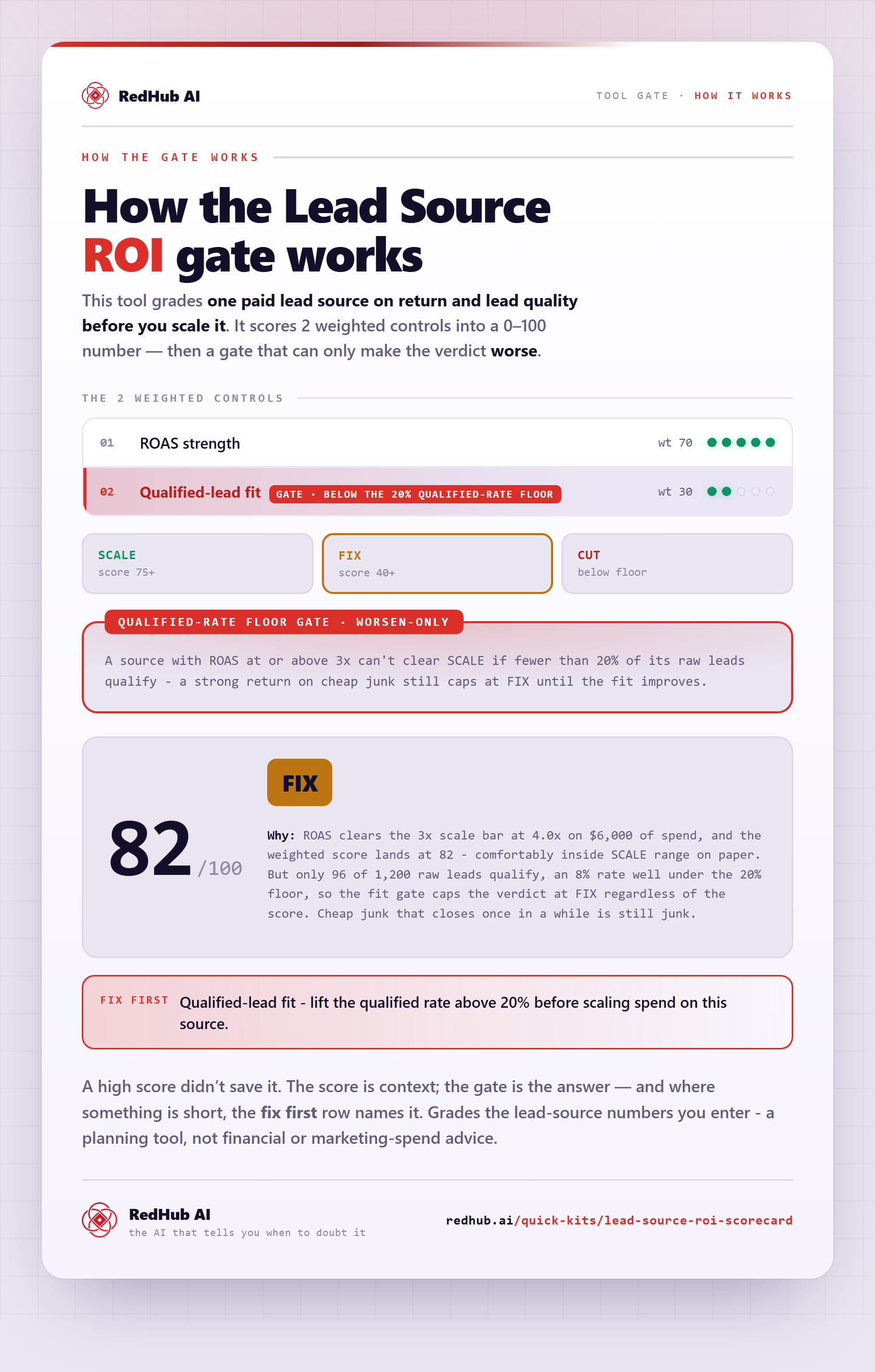
The gate this post refers to, drawn from the tool’s own logic. See the tool.