How to Write a High-Converting Landing Page (Section by Section)
RedHub AI Editorialupdated September 7, 20265 min read

Jump to a section7
TL;DR
- What it is: a section-by-section blueprint for a landing page that turns visitors into action.
- Who it's for: founders and marketers writing or rewriting a page. See the conversion kit.
- How it works: each section answers the visitor's next question in order — hero, proof, objections, offer, CTA.
- Bottom line: a converting page is a conversation, not a brochure. Answer questions in the order they're asked. Marketing guidance, not legal advice.
What makes a landing page convert?
A high-converting landing page answers the visitor's questions in the exact order they ask them, with a single action to take. The hero makes the offer and audience clear in five seconds; proof follows immediately to make the promise believable; an objection section clears the "yeah, but…" that stalls the decision; the offer lays out value and risk reversal; and one repeated CTA carries the click. Convert well and you're not being clever — you're being clear, specific, and honest, with real proof next to every claim.
Best for: anyone writing a page from scratch or fixing one that's flat — the AI Offer & Landing-Page Conversion Kit has the section-by-section templates. Marketing guidance, not legal advice.
A landing page fails when it's written as one big pitch instead of a sequence of answers. Visitors arrive with questions — what is this, is it for me, does it work, what's the catch, what do I do next — and they leave the moment a question goes unanswered. Write each section to answer the next question in line, and the page carries the reader all the way to the CTA.
The five sections, in order
- Hero — "What is this and is it for me?" One specific line naming the outcome and the audience. Not "Transform your business" — "Book 30% more demos from the traffic you already have." Clarity is won or lost here in the first five seconds.
- Proof — "Does it actually work?" The instant you make a promise, back it. Numbers, screenshots, a short demo, real testimonials — placed right under the claim, not buried at the bottom. A promise without adjacent proof reads as a boast.
- Objection handling — "Yeah, but…" Name the real hesitation and answer it. Too expensive, too complex, won't work for my case — a short objection FAQ removes the specific thing stopping the sale.
- The offer — "What exactly do I get, and what's the catch?" The value stack (everything included) and the risk reversal (guarantee, trial, easy exit) so saying yes feels safe.
- CTA — "What do I do now?" One clear action, repeated down the page, with nothing competing for the click. Every extra option is a reason to leave and "think about it."
Key insight: proof belongs next to the claim it supports, not in a testimonials block at the bottom. A believable page interleaves promise and evidence so the reader never has to take a claim on faith.
The hero does most of the work
If a visitor doesn't understand your offer in about five seconds, the rest of the page never gets read. So the hero headline earns the most editing. Make it specific — name the concrete outcome and who it's for — and resist the urge to be clever or vague. "Everything you need to grow" says nothing. "Turn cold email replies into booked calls without a VA" says exactly who it's for and what changes. Specificity reads as confidence; vagueness reads as filler.
Write every section from a proven template
The Conversion Kit gives you section-by-section landing templates and an honest-headline swipe file, so you fill in a structure that already converts instead of staring at a blank page.
Get the Conversion Kit — $79 →Cut the friction the page adds
Even a well-written page leaks conversions through friction. Every extra form field, every second of load time, every competing link in the header, every moment of "wait, what does this do?" costs you visitors who were otherwise ready. Before you add anything to a page, ask what question it answers. If it doesn't answer one, it's friction — cut it.
Helps conversion
- One specific headline
- Proof next to every claim
- A single, repeated CTA
Leaks conversion
- Vague, clever hero copy
- Testimonials dumped at the bottom
- Multiple competing actions
For the full picture, read the pillar on conversion copywriting, and don't skip the offer — the page can only carry an offer that's already strong.
Decision Guide
Use it if: you're writing a landing page or your current one gets traffic but few conversions.
Skip it if: the offer itself isn't compelling yet — fix that first, then structure the page.
Best first step: rewrite the hero to name one specific outcome and audience, then add proof directly beneath it.
FAQ
What sections should a landing page have?
Five, in order: a hero that names the outcome and audience, proof that the promise is real, objection handling for the "yeah, but…", the offer with its value stack and risk reversal, and one clear repeated CTA. Each section answers the visitor's next question.
What's the most important part of the page?
The hero headline. If visitors don't understand your offer in about five seconds, the rest of the page never gets read. Make it specific — the concrete outcome and who it's for — not clever or vague.
Where should testimonials and proof go?
Next to the claims they support, not dumped in a block at the bottom. Interleave promise and evidence so the reader never has to take a claim on faith — proof right under the promise is far more persuasive than a distant wall of logos.
How many calls to action should a landing page have?
One action, repeated. You can place the same CTA several times down the page, but it should always ask for the same thing. Multiple competing actions give visitors a reason to hesitate and leave.
Why isn't my landing page converting?
Usually one of three things: a vague hero, missing proof next to claims, or too much friction (long forms, slow load, competing links). Score the page section by section and fix the weakest one first. If it reads clearly and still stalls, look upstream at the offer or the traffic match.
Is this legal or just marketing advice?
Marketing guidance only, not legal advice — and there's no guaranteed conversion rate. Substantiate every claim you put on the page and use only real testimonials; the durable levers are clarity, proof, and low friction.
Turn your page into a sequence of answers
Hero, proof, objections, offer, CTA — each section answering the next question. Marketing guidance, not legal advice.
Get the Conversion Kit — $79 →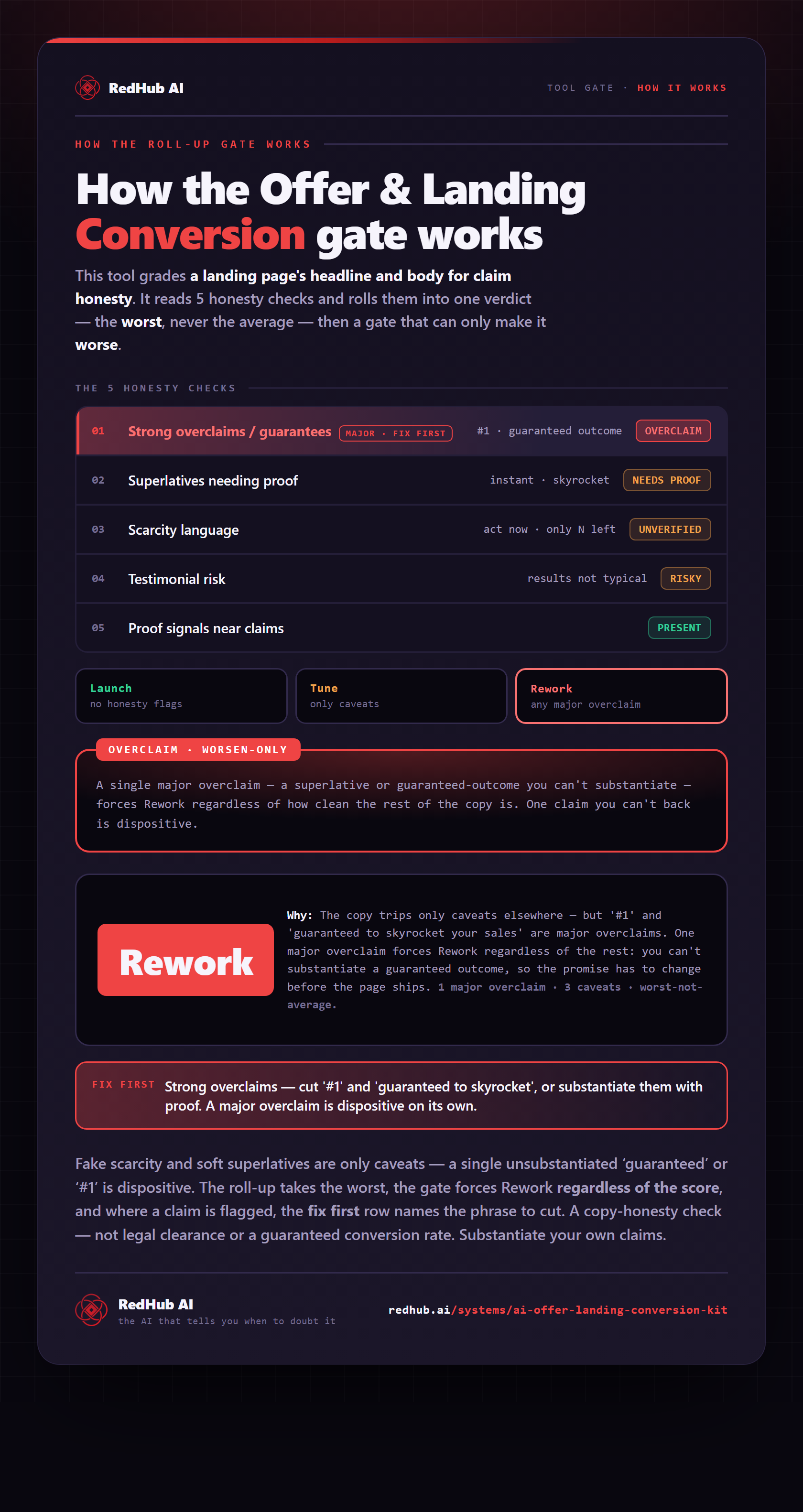
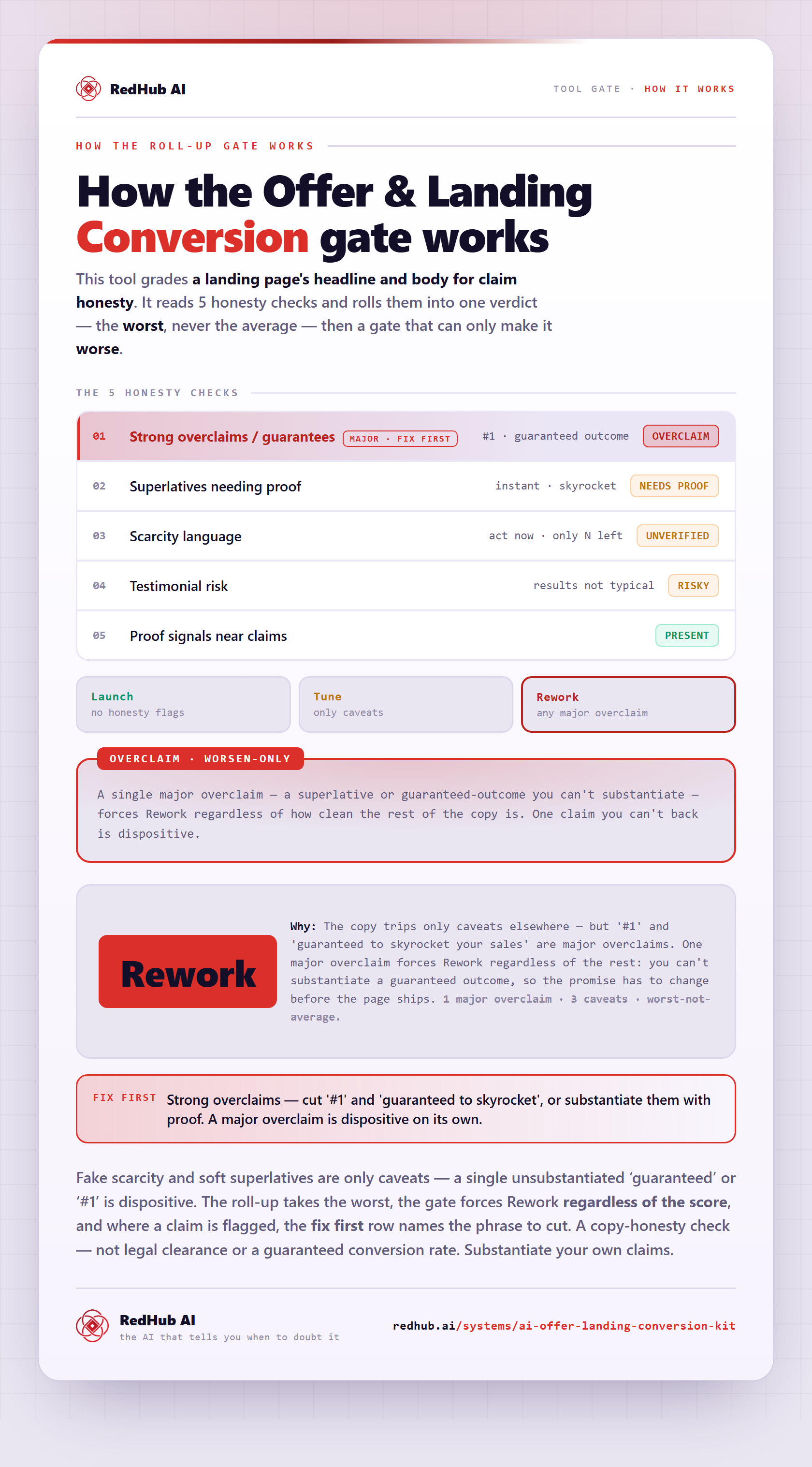
The gate this post refers to, drawn from the tool’s own logic. See the tool.