How to Design a Pricing Page That Converts
RedHub AI Editorialupdated September 20, 20267 min read

Jump to a section7
You design a pricing page that converts by making it do three jobs at once: let a visitor compare tiers in under ten seconds, anchor the value with an honest reference point, and remove the small friction points that make people close the tab before they decide. Most pricing pages only attempt the first job — a plain feature table bolted under a headline — and then wonder why healthy ad traffic isn’t turning into checkouts. Fixing that is page work, not price work: it’s about how the numbers are presented, not what the numbers should be. This guide walks through what a pricing page can actually control, a self-audit checklist you can run today, and the failure patterns that show up on page after page.
TL;DR: A converting pricing page compares tiers fast, anchors value honestly, and removes friction — it doesn’t rely on cleverness or a trendy layout. The Pricing Page Performance Pack ($49) audits your page against these three jobs and hands you a prioritized fix list to test. This guide links four deep dives: pricing page best practices, price anchoring, how many tiers to offer, and SaaS pricing page patterns.
The three jobs a pricing page has to do
A pricing page is not a brochure and it is not a sales pitch — it is a decision-support tool. The visitor already knows roughly what your product does by the time they land here; what they don’t know is which version to pick and whether the price is fair. That means the page has exactly three jobs:
- Compare. Make the differences between tiers obvious at a glance, without forcing a feature-by-feature read.
- Anchor. Give the visitor an honest reference point so the price they land on feels calibrated, not arbitrary.
- Remove friction. Strip out the small hesitations — unclear billing terms, hidden fees, a CTA that doesn’t say what happens next — that stall a decision that’s otherwise made.
A page can look modern and still fail all three. A page can look plain and nail all three. The visual design is a distant fourth priority behind these jobs, which is the opposite order most redesign projects run in.
What this is about — and what it isn’t
Be clear on the boundary before you touch anything: pricing page design is about how your prices are presented, not what they should be. If your instinct after reading this is “maybe we’re just priced wrong,” that’s a real and separate question — work it with Should I Raise My Prices? ($49) before you touch the page, because no amount of layout work fixes a price that’s genuinely mismatched to the value delivered.
There is also no universal “best” pricing page. The patterns in this guide — clear tier differentiation, a sensible anchor, fewer choices rather than more, honest framing — are guidelines backed by well-documented buyer psychology, not guarantees. What actually moves your number depends on your product, your buyer, and your price point, and nobody can promise you a specific lift before you test it on your own traffic. Anything that claims otherwise is selling a story, not a result.
Two more boundaries worth naming up front. This is about the pricing or plans page itself — it does not cover writing your offer or your general landing-page copy, which is the job of the AI Offer & Landing-Page Conversion Kit ($79). And it stops at the “Choose plan” click — what happens in the checkout flow after that is covered by the Checkout Friction & Abandonment Exposure Gate ($79). A pricing page can do its job perfectly and still lose the sale three screens later; that’s a different diagnosis.
The pricing-page self-audit checklist
Run through this before you commission a redesign. Most pages fail two or three of these, and fixing those is often cheaper than a full rebuild.
- Time yourself. Have someone unfamiliar with your product look at the page and time how long it takes them to say which tier they’d pick. Over ten seconds means the comparison isn’t doing its job.
- Check the recommended tier. Is one plan visually marked as the recommended or most popular choice? A page with no visual hierarchy between tiers forces every visitor to do the comparison math themselves.
- Audit your anchor. Is there a clear reference point — a genuine higher tier, or an annual-vs-monthly framing — that makes the target plan look reasonable? If every price floats alone with nothing to compare it to, there’s no anchor at all.
- Read every line for hidden cost. Setup fees, seat minimums, usage overages — if any of these live in a tooltip or a footnote instead of the price block, that’s friction disguised as fine print.
- Check the CTA copy. Does the button say what happens next (“Start free trial,” “Get instant access”) or just “Buy Now” with no context on billing or trial terms?
- Test on mobile, seriously. If tiers stack in a way that hides the comparison — no side-by-side view at all — a large share of your traffic never sees the differentiation you built.
- Look for the objection killers. Refund policy, cancel-anytime language, a two-line FAQ answering “can I switch plans later” — are the top three hesitations answered on the page itself, or does the visitor have to go hunting?
- Count your tiers. Too many options create decision fatigue; too few leave money and differentiation on the table. (Covered in full in how many pricing tiers should you have.)
Common pricing-page failure patterns
| Pattern | Why it hurts | What to try instead |
|---|---|---|
| Every tier looks identical | No visual signal for where to look first — the visitor does all the work | Mark one tier as recommended with a border, badge, or scale bump |
| Prices with no reference point | Nothing to anchor against, so every number feels arbitrary | Show an annual-savings framing or a real feature-value comparison |
| Fees revealed at checkout | Trust breaks at the worst possible moment, right before payment | Put every real cost in the price block itself, not a footnote |
| A CTA that says only “Buy” | No context on trial, billing cycle, or what happens after the click | State the next step plainly: trial length, billing start, or instant access |
What the Pack actually does
The Pricing Page Performance Pack ($49) is a diagnostic and playbook, not a magic redesign. It audits your page against the structure, anchoring, and friction checks above, then hands you a prioritized list of fixes ranked by likely impact and effort to test. It won’t tell you what to charge, and it won’t promise a lift number — it surfaces where your page is most likely losing buyers so you can run the test yourself instead of guessing which section to redesign first.
Pairs well with
If the diagnosis points at your price itself rather than the page, work that separately with Should I Raise My Prices? ($49). If the fix list includes rewriting your offer or your surrounding landing copy, hand that to the AI Offer & Landing-Page Conversion Kit ($79). And once the page itself is clean, check what happens after the click with the Checkout Friction & Abandonment Exposure Gate ($79) — a great pricing page still loses sales to a clunky checkout.
More in this guide
How do I design a pricing page that converts?
Make sure it does three jobs: lets visitors compare tiers in under ten seconds, anchors the price with an honest reference point, and removes small friction like hidden fees or vague CTAs. Visual polish matters far less than getting those three jobs right — a plain page that nails them will usually outperform a beautiful one that doesn’t.
Will a better pricing page fix low conversion by itself?
Not always. A pricing page can only fix page-level problems — structure, framing, and friction. If your price is genuinely mismatched to the value you deliver, that’s a separate pricing decision, not a design one, and it needs its own diagnosis before a redesign will help.
Is there a single best pricing page layout?
No. There are well-documented patterns — clear tier differentiation, a sensible anchor, limited choice — but what wins depends on your product, buyer, and price point. Treat every pattern in this guide as something to test on your own traffic, not a guarantee.
What is price anchoring and is it manipulative?
Anchoring is the real psychological effect where the first price a person sees shapes how they judge every price after it. Used honestly, it’s transparent tier framing — showing a recommended plan and a real comparison. It becomes manipulative only when the reference point is fake, like an inflated “was” price that never applied.
Does the Pricing Page Performance Pack tell me what to charge?
No. It diagnoses how your existing prices are presented — structure, anchoring, and friction — and prioritizes fixes to test. Deciding what your prices should actually be is a separate question, handled by Should I Raise My Prices? ($49).
How is this different from a landing-page copy tool?
This guide and the Pack focus narrowly on the pricing or plans page — tier structure, anchoring, and on-page friction. Writing your broader offer and general landing-page copy is a separate job, covered by the AI Offer & Landing-Page Conversion Kit ($79).
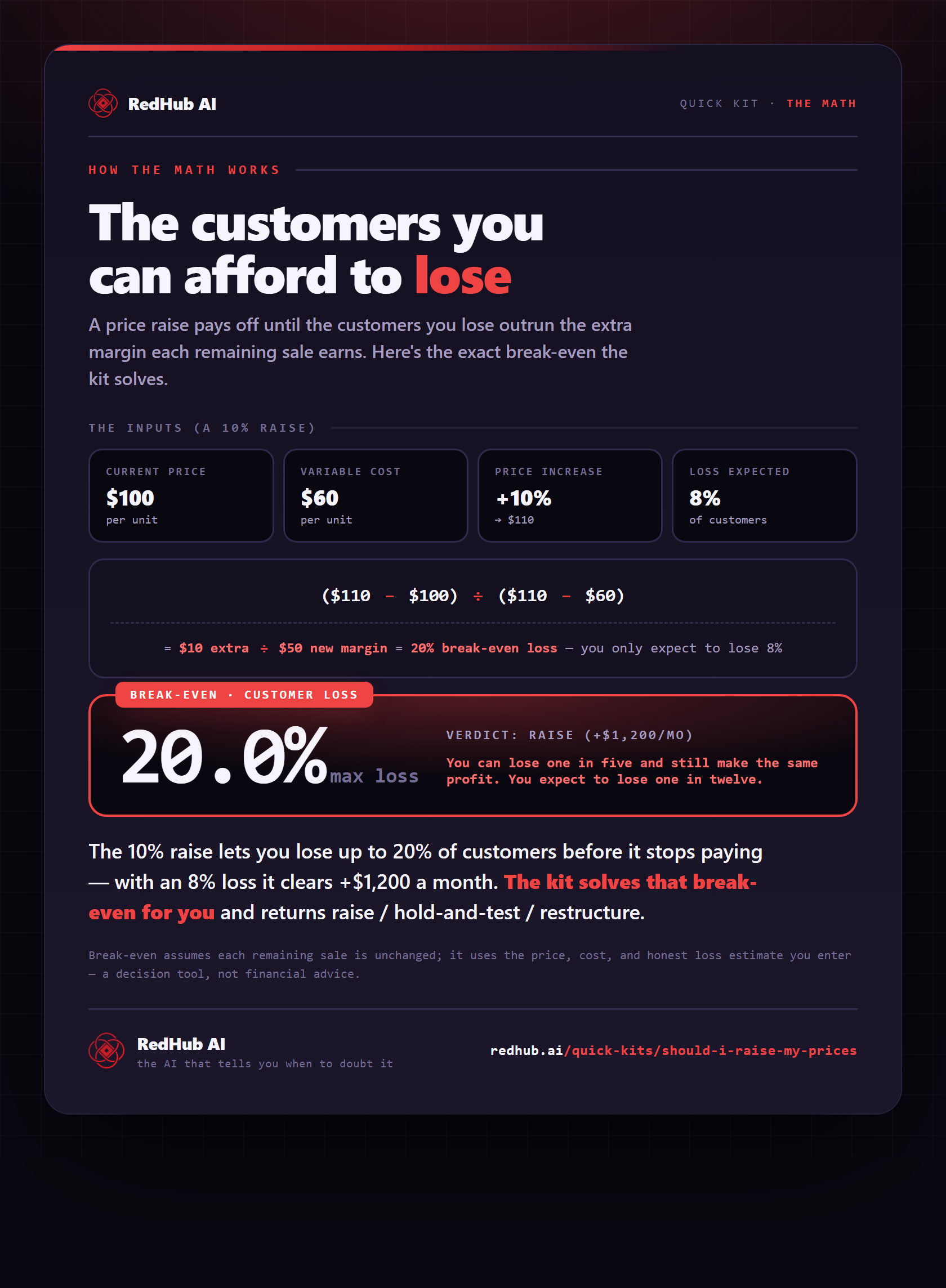
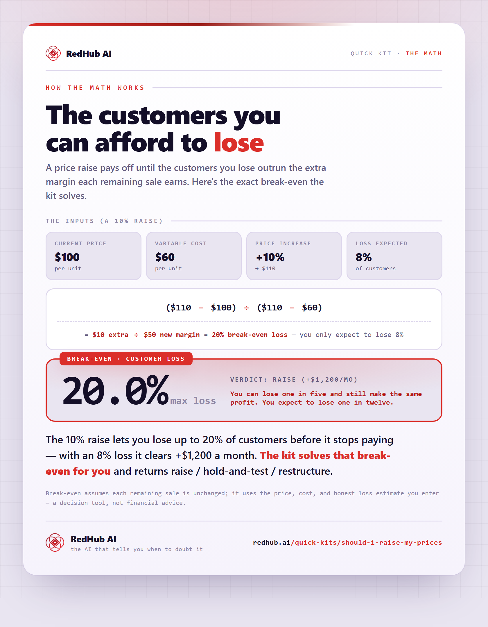
The gate this post refers to, drawn from the tool’s own logic. See the tool.