How to Design a YouTube Thumbnail That Gets Clicks
RedHub AI Editorialupdated September 7, 20266 min read
Jump to a section10
TL;DR
- What it is: a YouTube thumbnail is a tiny, high-contrast ad for your video that has to work at phone-screen size.
- What works: one clear idea, strong contrast, a legible face or emotion, and a promise the video actually keeps.
- What kills it: clutter, small or low-contrast text, and a thumbnail that oversells a video that can't back it up.
- Bottom line: a thumbnail is testable. Score it against your own channel's numbers before you decide it "feels right."
What makes a good YouTube thumbnail?
A good YouTube thumbnail communicates one clear idea in under a second, at the size it will actually be seen — a small rectangle on a phone screen next to a dozen competitors. It uses strong contrast, avoids clutter, often includes a face or a clear emotion, and promises exactly what the video delivers. A thumbnail that oversells the video wins the click and loses the retention, which is worse than a modest thumbnail that's honest.
Best for: anyone whose click-through rate is below their own channel average. The YouTube Packaging & Retention Engine ($99) tells you whether a low-performing video actually has a thumbnail problem before you spend an afternoon redesigning one.
A YouTube thumbnail has one job: earn a click from someone scrolling past a dozen others on a phone screen. It has about a second to do it. That's the whole design brief — everything below exists to serve that one second.
This post is part of our YouTube packaging series — the thumbnail is one half of the packaging pair, alongside the title.
Rule one: one idea, not five
A thumbnail crowded with three text boxes, two arrows, and a circled detail isn't communicating three things — it's communicating nothing, because a viewer's eye has nowhere to land in the half-second it gets. Pick the single most compelling idea in the video and build the thumbnail around only that. If you can't name the one idea in five words, the thumbnail isn't ready.
Rule two: contrast wins at thumbnail size
Your thumbnail competes at roughly 120 pixels wide on a phone. Subtle color differences, thin fonts, and busy backgrounds all disappear at that size. High-contrast subjects against a simpler background read instantly; low-contrast, cluttered compositions blend into the noise of the feed around them. If two elements are close in brightness or color, the eye can't separate them fast enough to matter.
Rule three: faces and emotion, used honestly
Viewers are wired to notice faces first, and a clear expression — surprise, focus, concern — reads faster than almost anything else in a thumbnail. This works because it's true of how people scan images, not because it's a trick. The failure mode is a face expressing an emotion the video doesn't earn: shocked-face thumbnails on unremarkable videos train viewers to stop trusting your thumbnails, which erodes click-through rate over time even when the thumbnail "technically" works today.
Rule four: match the promise to the video
This is the rule most creators break without noticing. A thumbnail's job isn't only to earn the click — it's to earn a click that turns into a watch. A thumbnail that overpromises pulls people in and loses them within seconds, which is worse for the channel than a modest thumbnail that undersells slightly. Retention is the gate; the thumbnail is the optimization on top of it, never a replacement for it.
Key insight: a high click-through rate on a thumbnail attached to a video with weak retention isn't a win. It's the specific mismatch that gets suppressed in recommendations — and no thumbnail edit fixes a broken promise.
Strong signal vs. weak signal
| Weak thumbnail signal | Why it fails | Fix |
|---|---|---|
| Three text boxes and two arrows | Nothing for the eye to land on in half a second | Pick one idea; delete the rest |
| Thin gray text on a busy photo | Disappears at 120px wide on a phone | Bold text, high-contrast background |
| Shocked face on a routine update video | Overpromises; viewer feels misled within seconds | Match the expression to what the video actually delivers |
| Same template every video, no variation | Blends into your own channel's row | Vary composition while keeping brand consistency |
How to build a thumbnail worth testing
- Write the one-idea sentence first. If you can't summarize the thumbnail's message in five words, it's not focused enough yet.
- Pick a background that isolates the subject. A busy background competes with your subject for the same half-second of attention.
- Add text only if it adds new information. If the text repeats the title, cut it — you're using the same real estate twice.
- Shrink it to phone size before you ship it. Zoom your draft down to roughly 120px wide. If you can't read it instantly, it fails the size test.
- Check the promise against the video. Would someone who clicked based on this thumbnail feel like the video delivered? If not, redesign or re-cut the video.
Once you've built a thumbnail you believe in, the next step isn't shipping it and hoping. It's testing it against a real alternative and checking whether the result is a real gap or noise — that's covered in YouTube A/B testing: how to call a real winner. And if a thumbnail is pulling clicks but the video is losing viewers fast, that's a retention problem, not a design problem — see audience retention: how to read your retention graph.
Know if the thumbnail is the actual problem
The YouTube Packaging & Retention Engine ($99, one-time) scores every video's click-through rate and retention against your own channel baseline — so you rework the thumbnail only when the thumbnail is genuinely what's holding a video back.
Get the Engine — $99 →If the bottleneck is actually production time — getting videos filmed and edited in the first place — the Authority Video Engine ($199) is the workflow layer that turns an idea into a finished, recorded upload.
Decision Guide
Use this approach if: your click-through rate is below your own channel average and you suspect the thumbnail, not the video, is the problem.
Skip it if: your click-through rate is fine but viewers leave fast — that's a retention problem, not a thumbnail problem.
Best first step: shrink your last three thumbnails to phone size and time how long it takes you to identify the one idea in each. If it takes more than a second, simplify before you touch anything else.
FAQ
What makes a good YouTube thumbnail?
One clear idea, strong contrast, a legible face or emotion where it fits, and a promise the video actually delivers on. It has to work at roughly 120 pixels wide, which is how most viewers actually see it.
Should every thumbnail have a face on it?
No. Faces work when the expression is honest and the video earns it. A face that overpromises the video's content trains viewers to distrust your thumbnails over time.
How much text should a thumbnail have?
As little as possible, and none that just repeats the title. Text should add information the image alone doesn't carry — otherwise it's clutter competing with your subject.
Why did my thumbnail get a lot of clicks but low watch time?
The thumbnail likely overpromised. It earned the click, but the video didn't deliver on the promise fast enough, so viewers left. That's a retention problem, not something a new thumbnail fixes.
Can I test two thumbnails against each other?
Yes, and you should — but a few days of higher views on one version isn't proof. Run a real significance check before declaring a winner, covered in YouTube A/B testing.
Does a great thumbnail guarantee more views?
No. A strong thumbnail improves your odds of earning the click; it can't guarantee distribution, which depends on the platform, your retention, and factors outside any template's control.
How is a thumbnail different from packaging overall?
The thumbnail is one half of packaging — the title is the other. They have to work together: see the full YouTube packaging guide for how the pair fits together.
Test the thumbnail instead of guessing
The Engine scores every video against your own baseline and runs a real significance test on your thumbnail A/B tests. One-time $99, instant download. 30-day guarantee.
Get the YouTube Packaging & Retention Engine — $99 →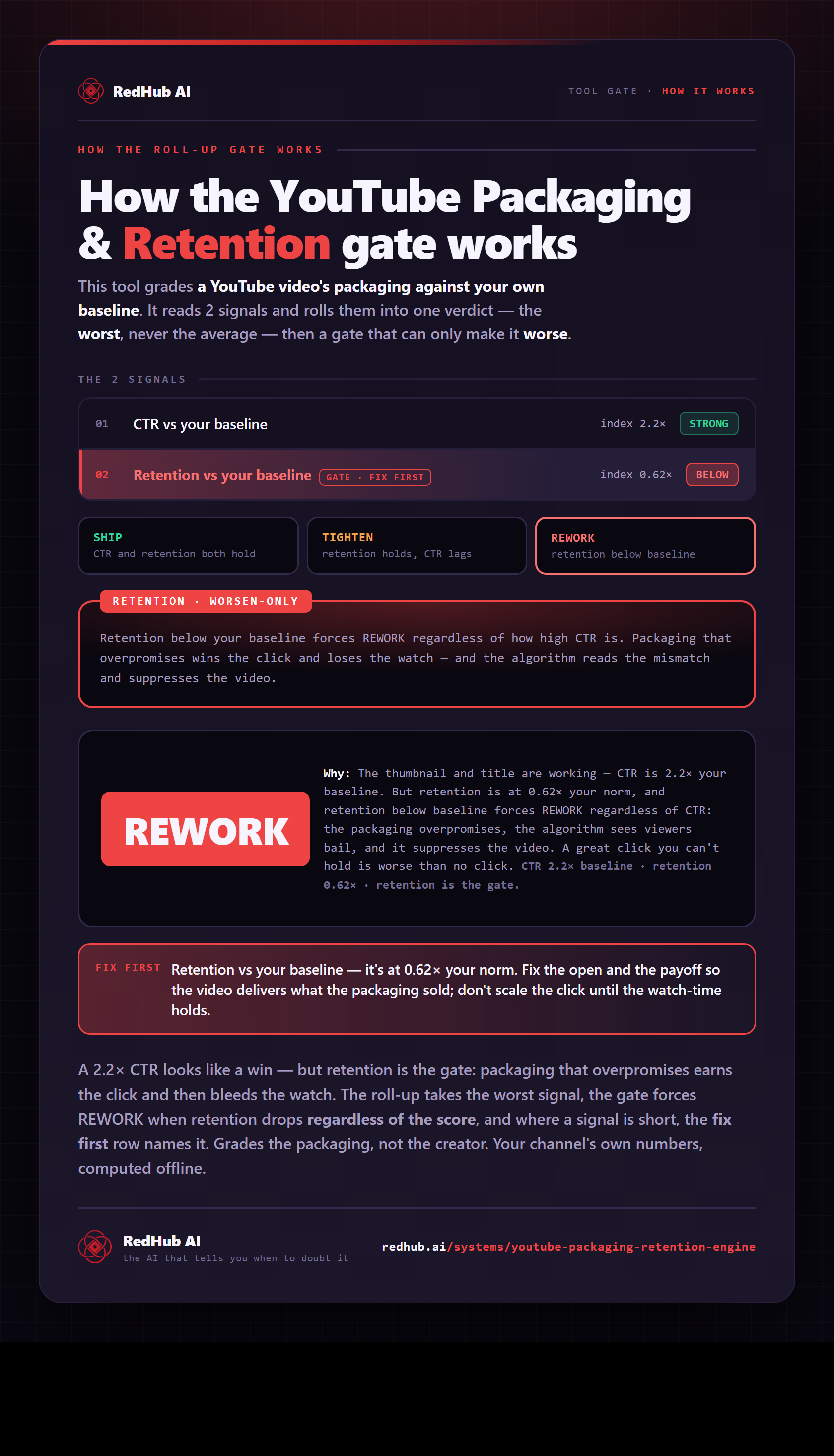
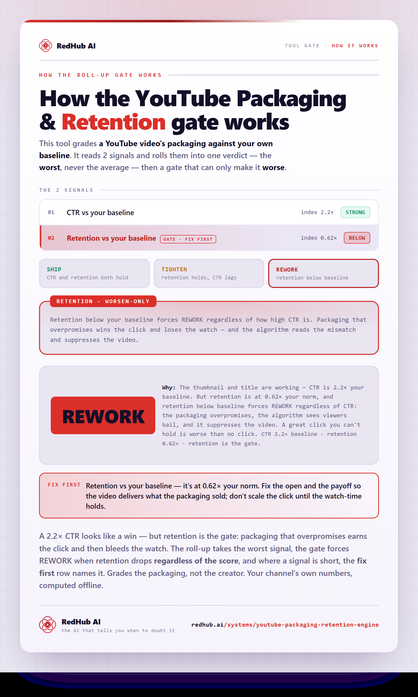
The gate this post refers to, drawn from the tool’s own logic. See the tool.